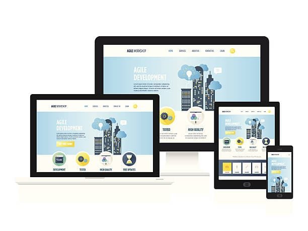
Having been Shopify Experts UK developer, I’ve witnessed the upsurge of mobile shopping trends. It is very important to make sure that the Shopify stores that we have are bug-free and easy-accessing for all the devices. One of the crucial habits that have to be built to maintain such a standard is mastering responsive design for Shopify development.
The primary focus of responsive design is to make sure that webpages are being created in such a way that they can fit on different devices and that all features are made accessible to all users, regardless of their device. This kind of feature is helping large enterprises to gratify their clients with interactive and engaging services. This kind of site provides a wonderful experience, no matter if it is on a tablet or a smartphone. This is the reason the customer will stay in a joyful orbit all the time.
Upcoming in this paper, I plan to share my best goals for the use of responsive design in Shopify development, which is to give our customers a more immersive experience as well as ensuring that our store is faster, easier to use and available on any device.
What Is Responsive Design in Shopify Development?

Responsive design is an approach which allows the website to rearrange its layout, images, fonts, and many other elements based on the users’ device. When you are shopping from Shopify, it doesn’t matter if you are viewing the site on a mobile phone, tablet, or computer because the website will make the necessary adjustments so you can see every image and initiate interaction.
In the scope of Shopify development, the responsive design is affecting the users’ perspective in a manner that they can find a website which switches its layout on the fly and thus is speeding up their online shopping operation. More than 50% of revenues from online shopping will be due to mobile shopping. Hence, it is highly critical to ensure that we can meet their demands by making the site fully optimized for all sorts of devices.
Why Responsive Design Matters for Shopify Development
Responsive design is a technical necessity and the main competitive advantage while making choices about business strategies for web development. Here is why responsive design is crucial for Shopify stores:
1. Improved User Experience
A responsive Shopify Agency in UK guarantees that the user has one and the same experience whatever the device might be used for accessing the site. A customer is looking for straightforward and trouble-free processes in selecting, adding, or removing items in the shopping cart.
The responsive designs, at last, allow electronic stores to give these seamless operations to clients. During the use of a site such as a store, products surely compare since they are the ones which the users are going to purchase. Such a condition can be the result of an unresponsive store which can be fairly painful to navigate the homepage by the user and thus higher bounce rates and no items paid for in the end.
2. Mobile Optimization
With mobile phones accounting for more than 50% of eCommerce web visits, mobile optimization is no longer a matter of choice. A responsive design ensures that not only is the Shopify store mobile-friendly by uploading pages swiftly, having increased fluid navigation, and images that are equally optimized for small screens but it is in accord with Google’s mobile-first indexing which directly influences our SEO performance.
3. SEO Benefits
Google’s first place goes to websites that provide a user-friendly mobile interface. Through the mastery of the responsive design, we create more opportunities to obtain first positions on the search engine results pages (SERPs), thus attracting more organic traffic to our Shopify store.
4. Cost Efficiency
Responsive design gives us the opportunity to avoid the need to develop separate websites for both mobile and desktop users when we go for the development of a new site. For this method, we save time, money, and resources on the site’s smooth operation on the different platforms.
Best Practices for Responsive Design in Shopify Development
To make sure the Shopify store is fully optimized for responsive design, the key thing to do is to follow the following experiences that have proven to be incredibly helpful throughout time. First of all, let’s take a walk through the best ways of implementing effective responsive design for Shopify development.
1. Use Fluid Grids
The building block of responsive web design is a fluid grid. Units of flexible sizes (in a fluid grid) have been used instead of ordinary ones like pixels set in granite (fixed grids). They know how to flow over the size if using a powerful scale factor.
In Shopify, you can set responsiveness on some layouts using CSS media queries for different devices’ screen width. This method guarantees that we have the best style of our store at all the times delivering an equal ease of access to the users independently from their devices.
2. Optimize Images for Different Devices
Images also contribute to making a web page more or less responsive. Uncompressed, large images slow down a Shopify store, causing poor user satisfaction and a higher bounce rate. We need to make sure that our images can support display in various devices by using responsive images and following some compression methods.
As Shopify developers, we have the potential to use strategies such as Lazy Loading. This feature assures that images will load when they are required, narrowing the initial load time. Additionally, using the scree attribute in the HTML of our publication allows the browser to select the correct image size that matches the resolution of the user’s screen making it so that images look at their best on all screens.
3. Prioritize Mobile-First Design

The first item on the list of benefits is the ability of the mobile-first approach to design our Shopify store with the smallest screens in focus first and hence to grow bigger ones like desktops and tablets from that small start. Since the increasing level of mobile e-commerce has shown a new trend of mobile-customer as a primary visiting plan in the store which has been facilitated by the responsive design, choice of a mobile-first strategy for the website is much preferable in avoiding mixed traffic slowing down the process.
The mobile-first approach creates space for us to concentrate on simplicity and functionality. Because mobile interfaces have a smaller screen, we give top priority to the main things like the navigation menu, the call-to-action buttons, and the product info.
4. Implement Flexible Typography
Similar to images, text should also be scaling properly across devices. We use relative font sizes (i.e. “em” or “rem”) instead of fixed sizes (i.e. pixels)
